Design Direction
Client Liason
Primary Packaging Design
Secondary Packaging Design
2D Renderings
Pre-Production
Post-Production
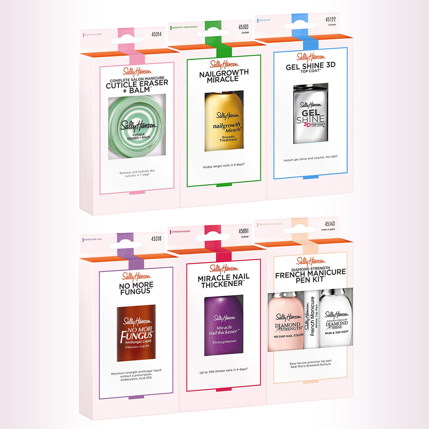
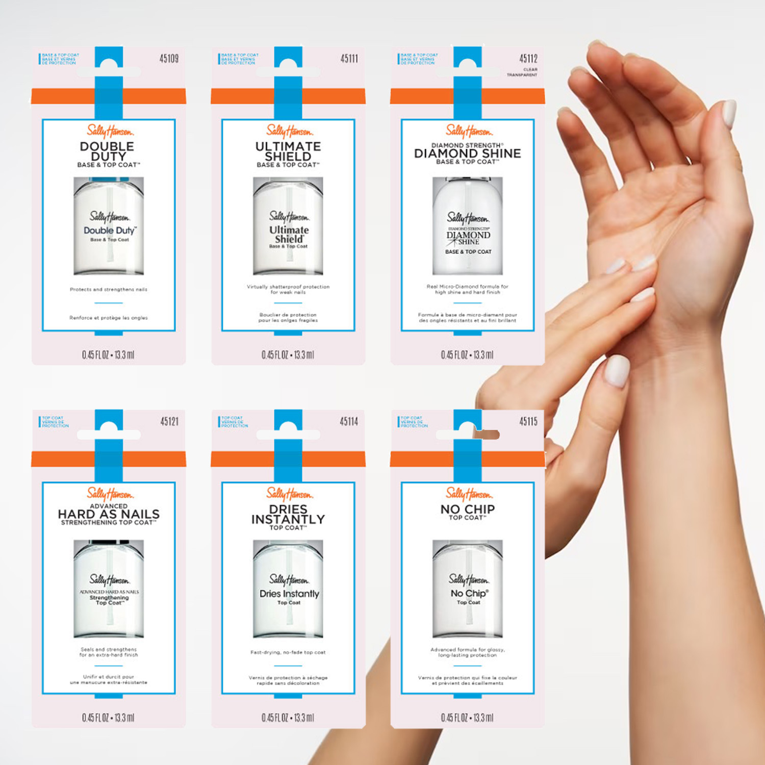
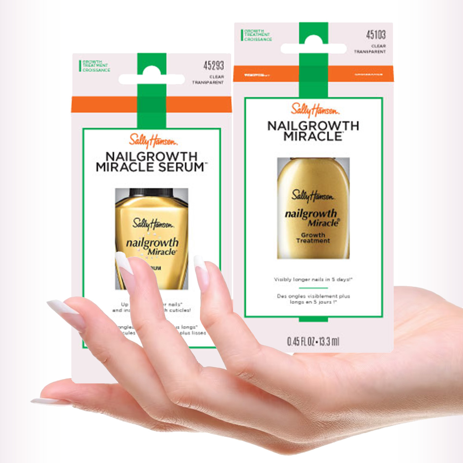
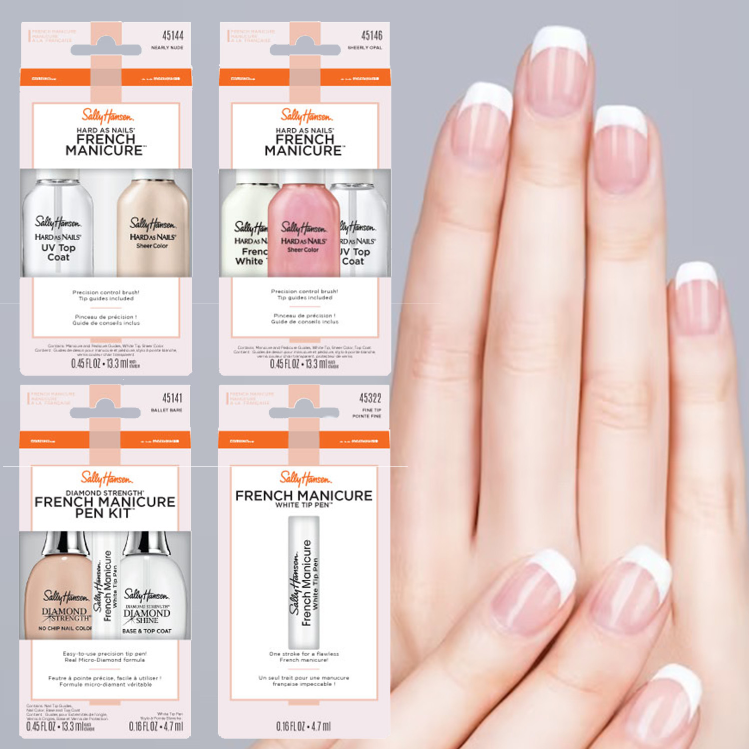
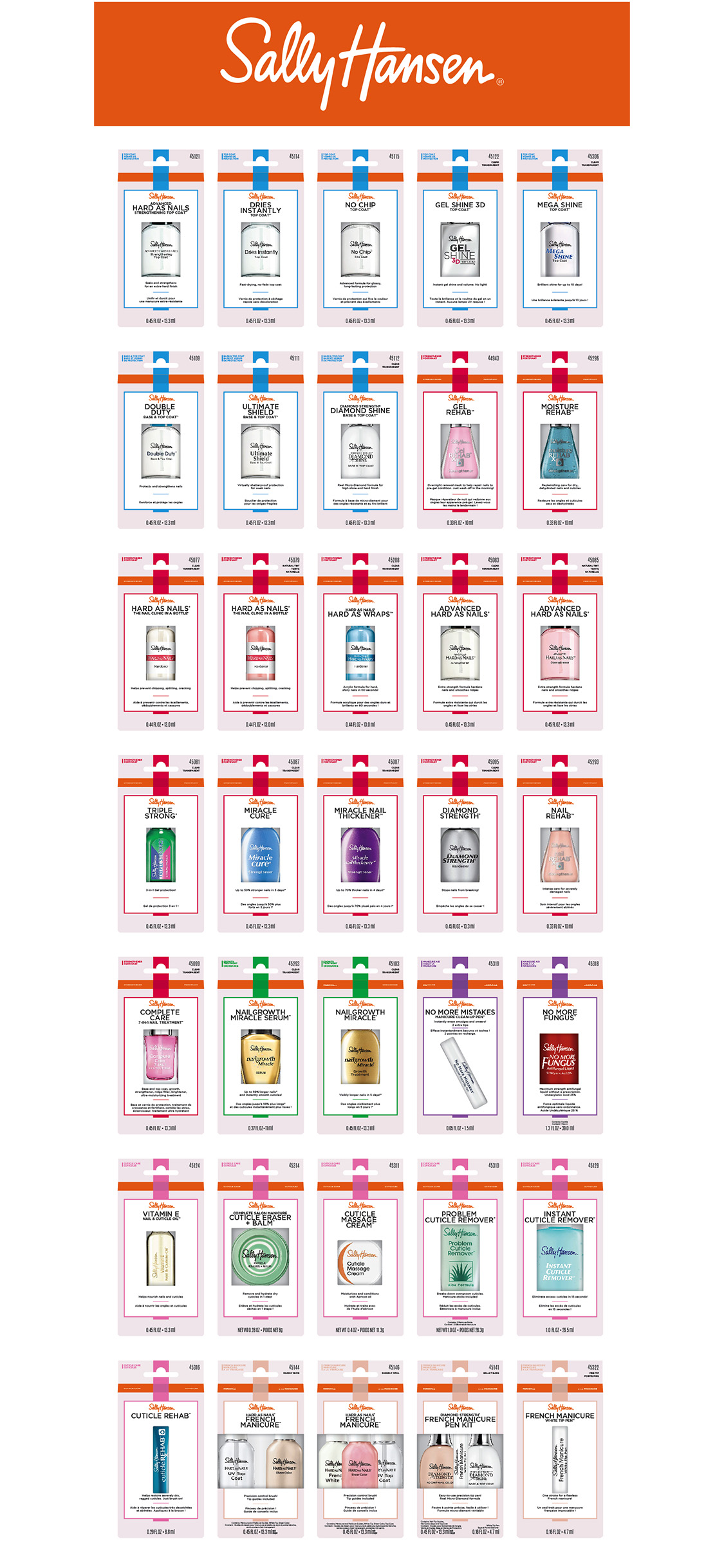
Sally Hansen wanted a complete overhaul of its secondary packaging for its nail care division. They requested a cleaner, more modern look that would sell on merchandising pegs or slotted display units. The first step was to understand their full range of products and segment them into different categories within their care SKUs.
Allot color codes for the six divisons to stand out on display and work cohesively with Sally Hansen’s orange brand color while giving a sense of care.
Choose fonts that worked with the brand’s handwritten style logo and other set mandates such as merchandising regulations, OTD regulations, dual language copy, and a cut-out window for consumers to see and touch the product.

